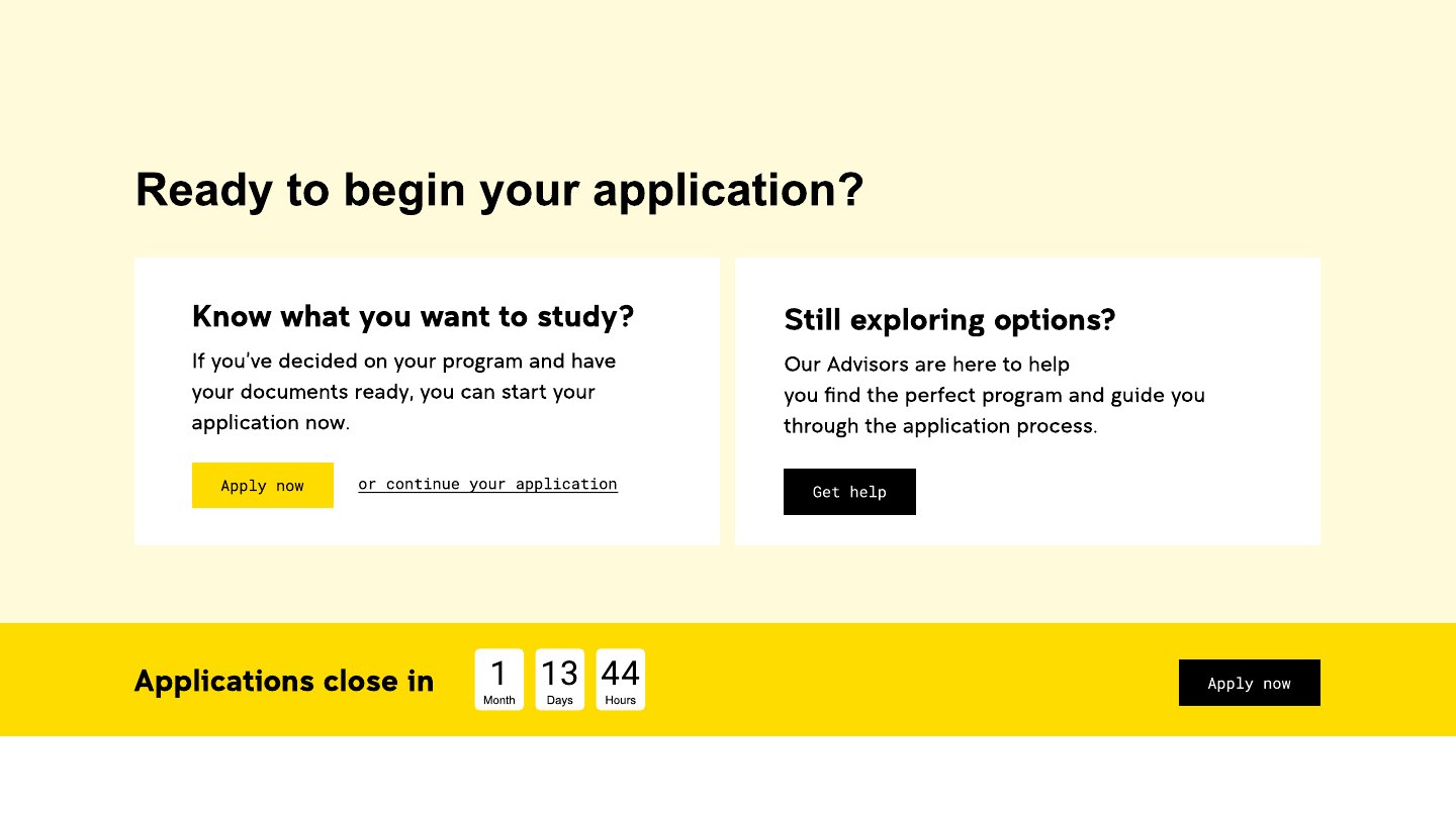
01
About 20 page templates
Homepage, study-area pages, SEO and paid-search program pages, fees, entry and application, FAQ, about, contact, a blog and the enquiry thank-you flow, each in desktop and mobile versions.
UNSW Online needed a website that helps prospective students across ten study areas, from Data Science to Psychology, find a program, compare options and apply. Working with a UX design manager who set the core page designs, I built out the page templates and the component library, and designed the blocks that let the site grow.

Students had to find a program, compare options and apply, across ten study areas and dozens of programs.
UNSW's black-and-yellow brand had to hold up on a phone just as well as on a desktop.
New programs kept coming. Each one couldn't need its own page designed from scratch.
The same questions repeat on every program page: what will I study, what does it cost, can I get in, what's it like online. Answering them as reusable blocks makes every new page fast to build and consistent.
SEO program pages go deep for people researching. Paid-search pages get to the point for people arriving from ads.
Each of the ten study areas has its own icon, thumbnail and banner, so the site feels easy to navigate rather than one long catalogue.
Homepage, study-area pages, SEO and paid-search program pages, fees, entry and application, FAQ, about, contact, a blog and the enquiry thank-you flow, each in desktop and mobile versions.
Buttons in every state, icons, headers and footers, banners, tabs, tables, forms, FAQ accordions, testimonials, career outcome cards, program cards and pagination, built as Figma variants for device, layout and colour.
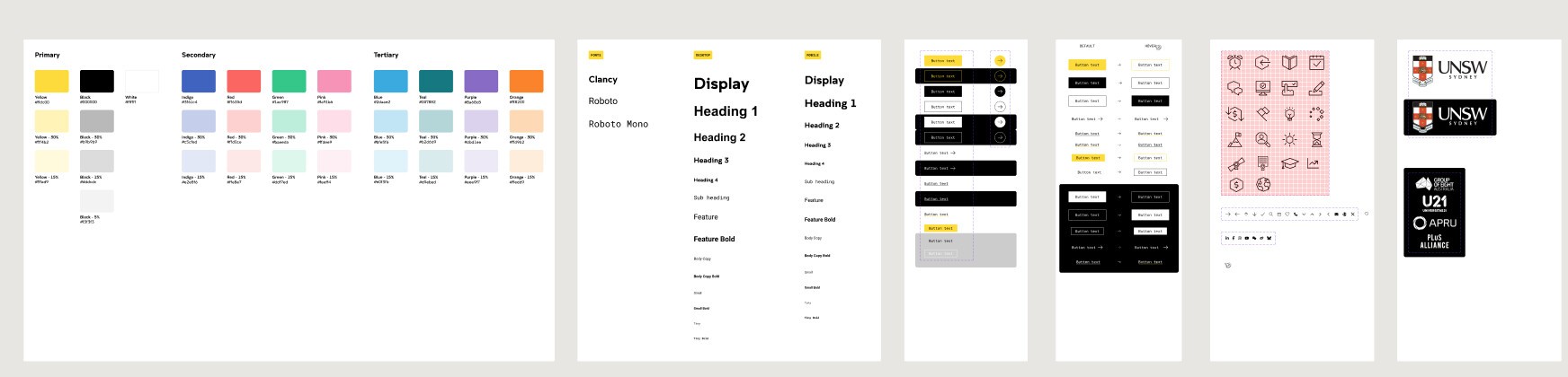
Beyond the core page designs, I designed the rest of the blocks in the library: the content, data, card, tab and form components that let the site scale past those first pages.
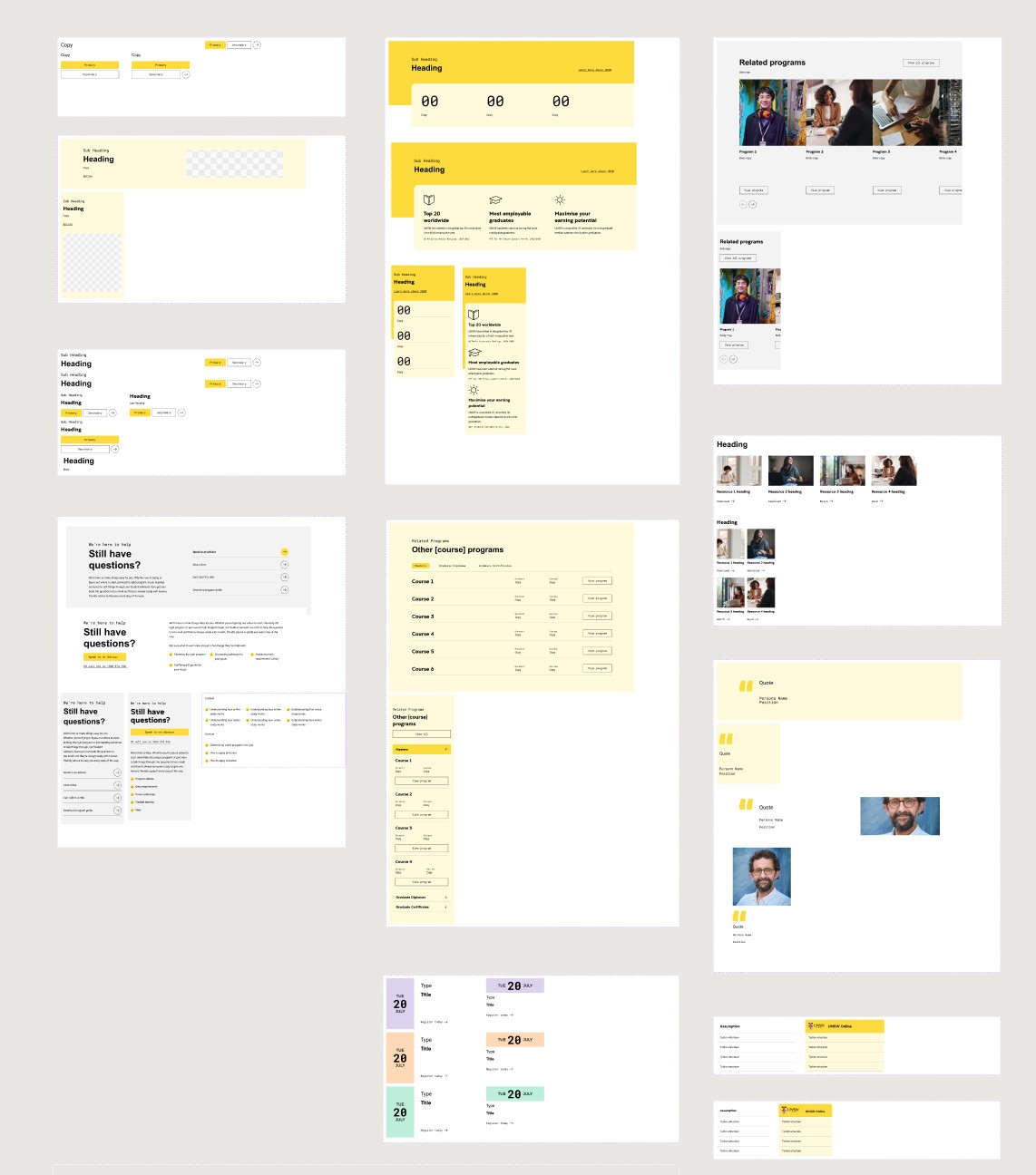
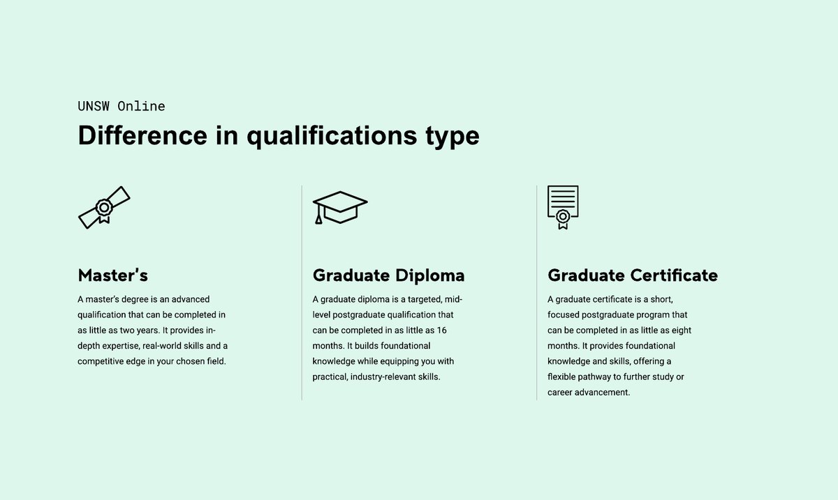
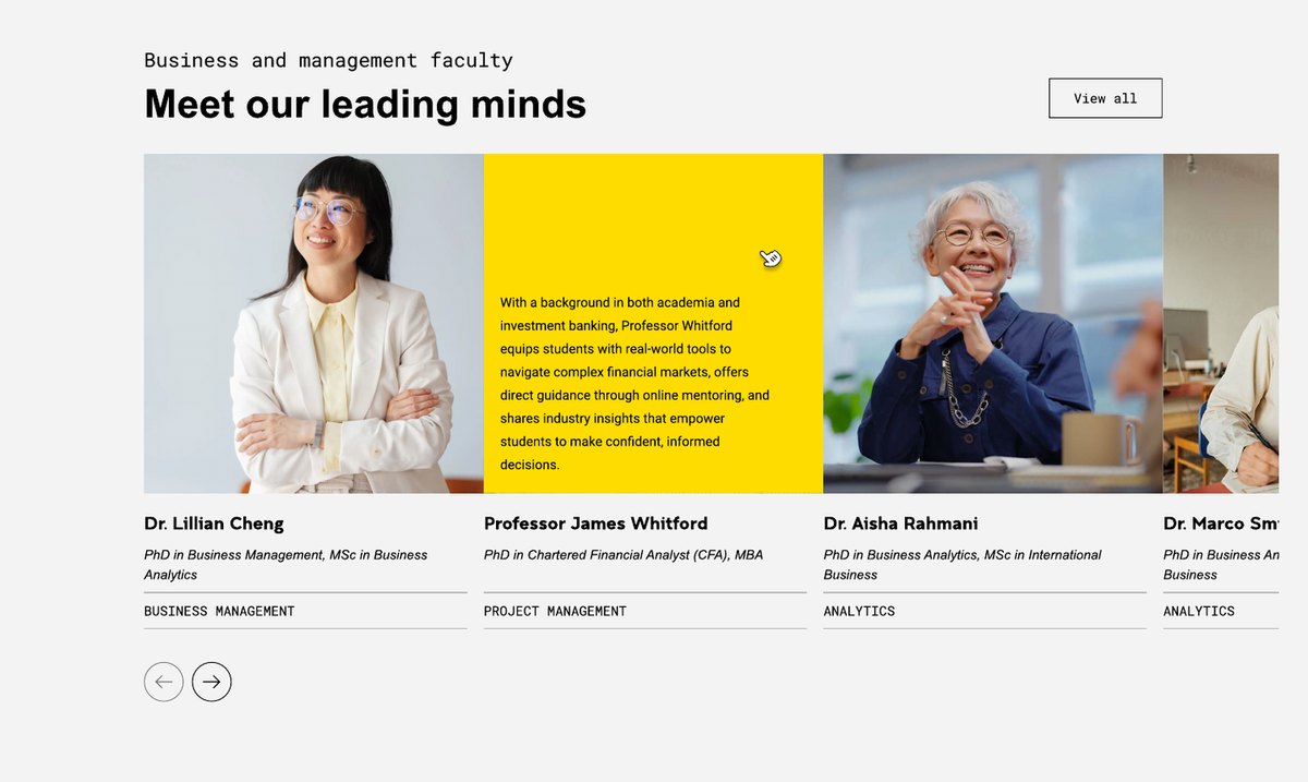
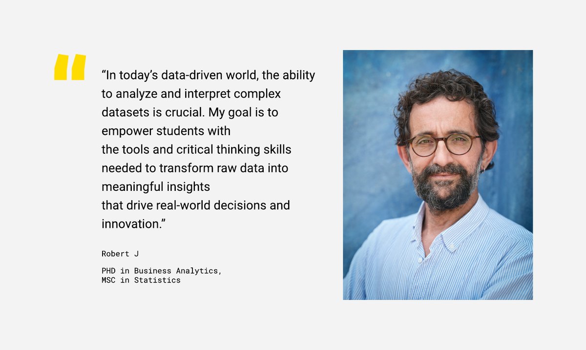
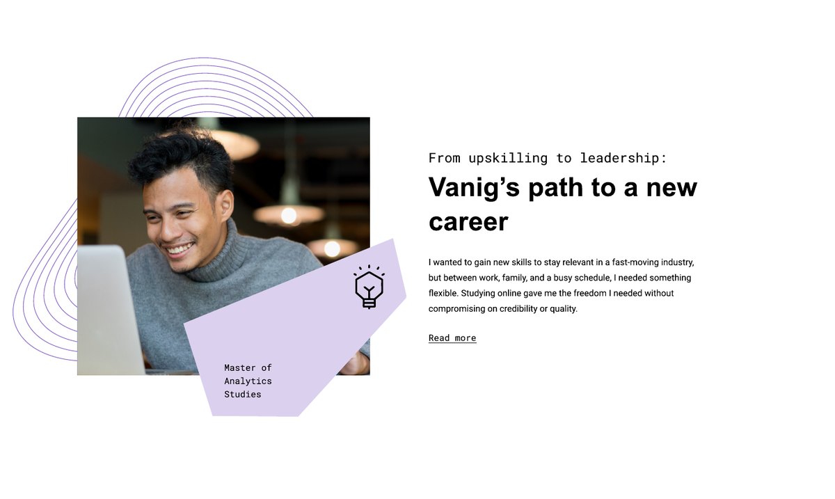
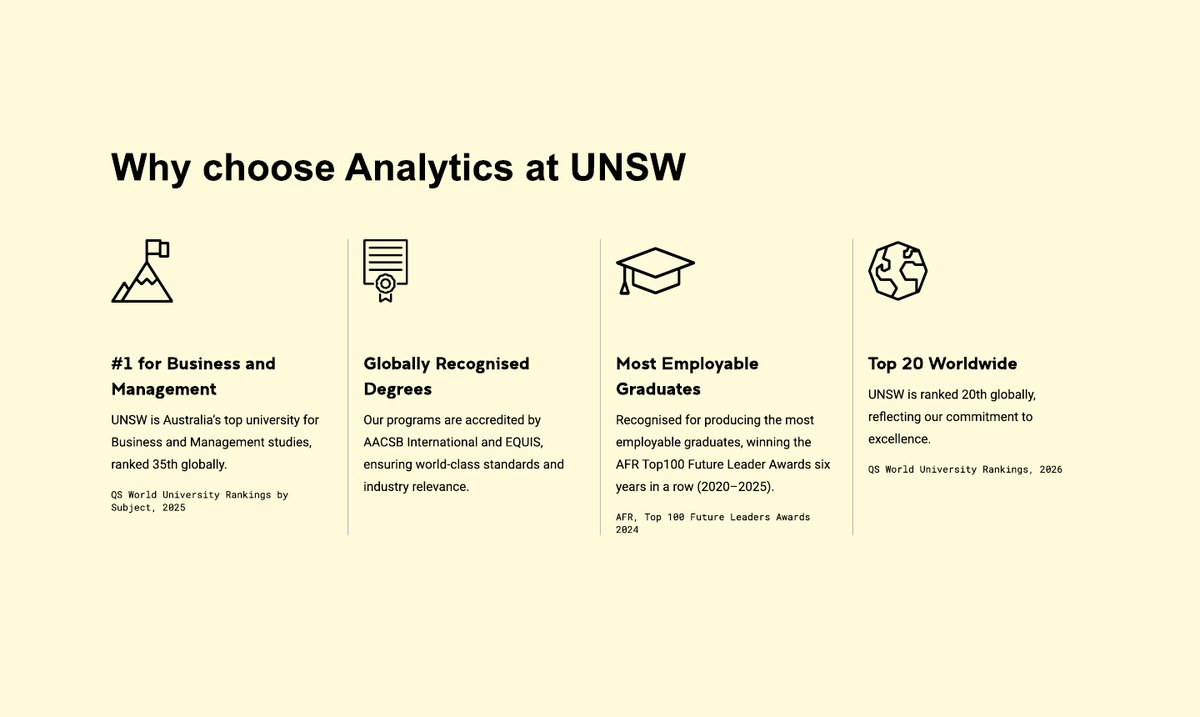
Stats panels, qualification comparisons, faculty carousels, testimonials, student stories and proof points, each reused across study areas and programs so every page is quick to build and still feels considered.
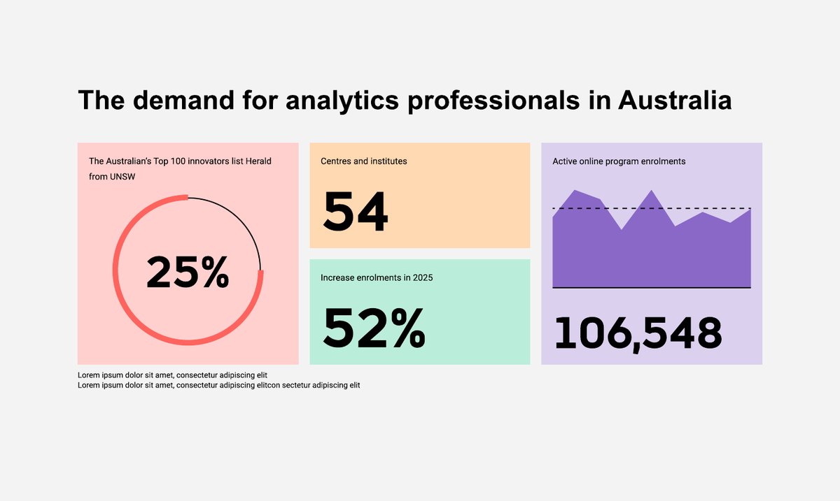
The site is live at studyonline.unsw.edu.au. New programs and study areas can be added from the same templates and blocks, without designing from scratch.