← All work
Case study · Gaia One

A reef conservation projectthat became a movement

Gaia One began as conservation packages at Tevana House Reef, a sustainable resort in South Sulawesi. As its ambitions grew, it needed an identity of its own: one that stood apart from the resort but kept its values of nature, holistic travel and sustainability. Its work happens in two places, restoring coral underwater and cleaning up on land, so the brand had to tell both stories.

Client

Gaia One, Tanjung Bira, South Sulawesi

Role

Brand designer, solo

Services

Brand identity, logo system, merchandise, social content

Status

Live, now signing the Gaia One dive shop

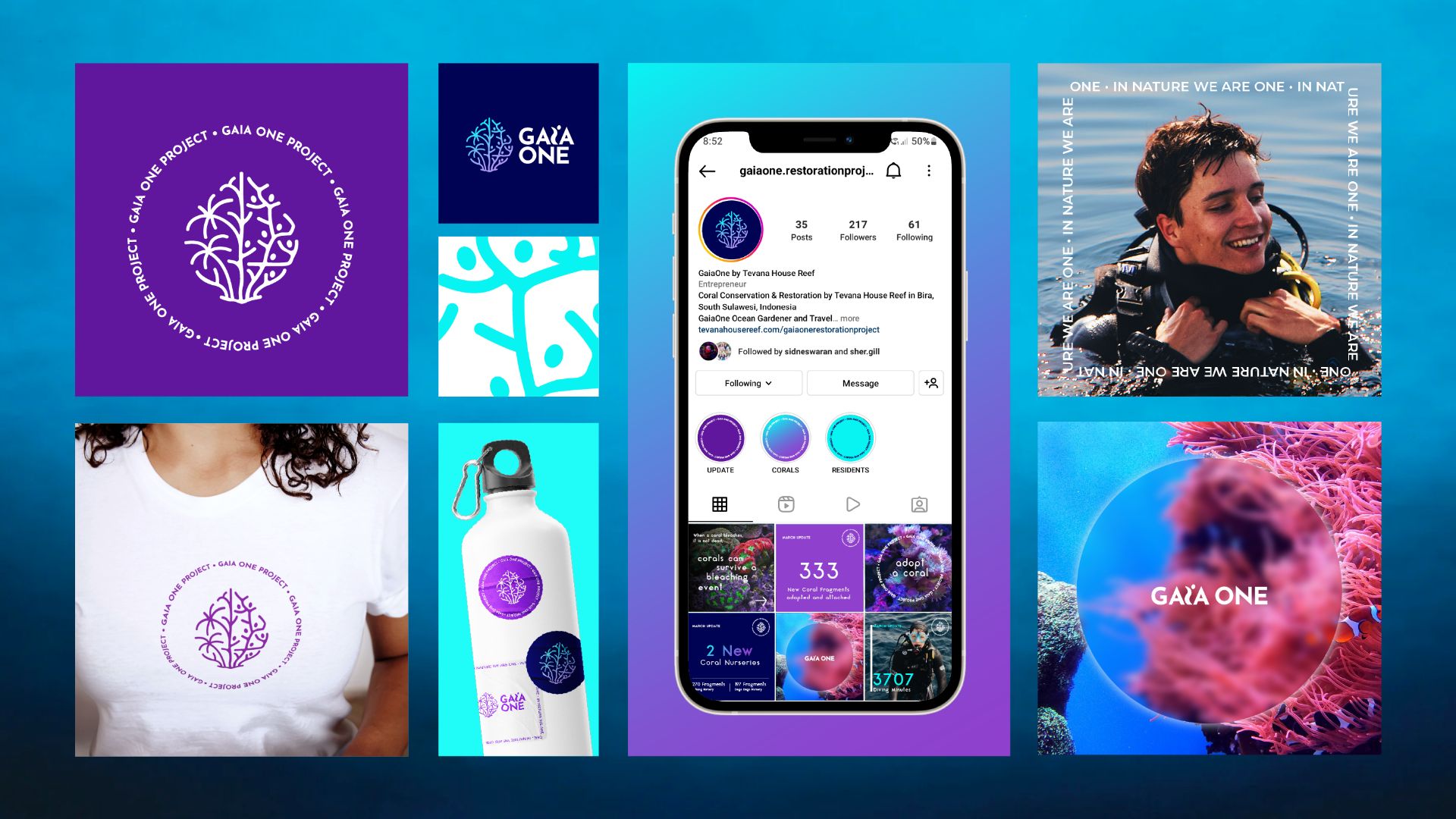
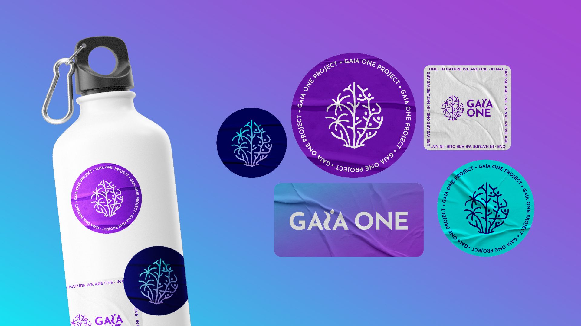
Gaia One water bottle and stickers on a purple-to-turquoise gradient

The Challenge

  1. Step out of the resort's shadow

    Gaia One needed its own identity, distinct from Tevana House Reef, without losing the values they share.

  2. Two places, one story

    The work happens underwater, restoring coral reefs, and on land, running clean-ups. An ocean-only brand would tell half of it.

  3. Turn visitors into ambassadors

    The brand had to travel home with people, on merchandise and in their feeds.

The Solution

  1. A mark with two halves

    Built from the ancient symbol for Mother Nature and split down the middle: coral on one side for the reef work, coconut palms on the other for the land work.

  2. Everyone is part of it

    A custom "i" in the wordmark is shaped like a person, so every individual reads as part of the movement.

  3. Bold, purposeful, self-aware

    The direction was bold and purposeful, closer to a movement than a resort add-on. The palette mimics an iridescent coral reef shading into the deep ocean.

Outcomes

The identity, piece by piece

01

The mark

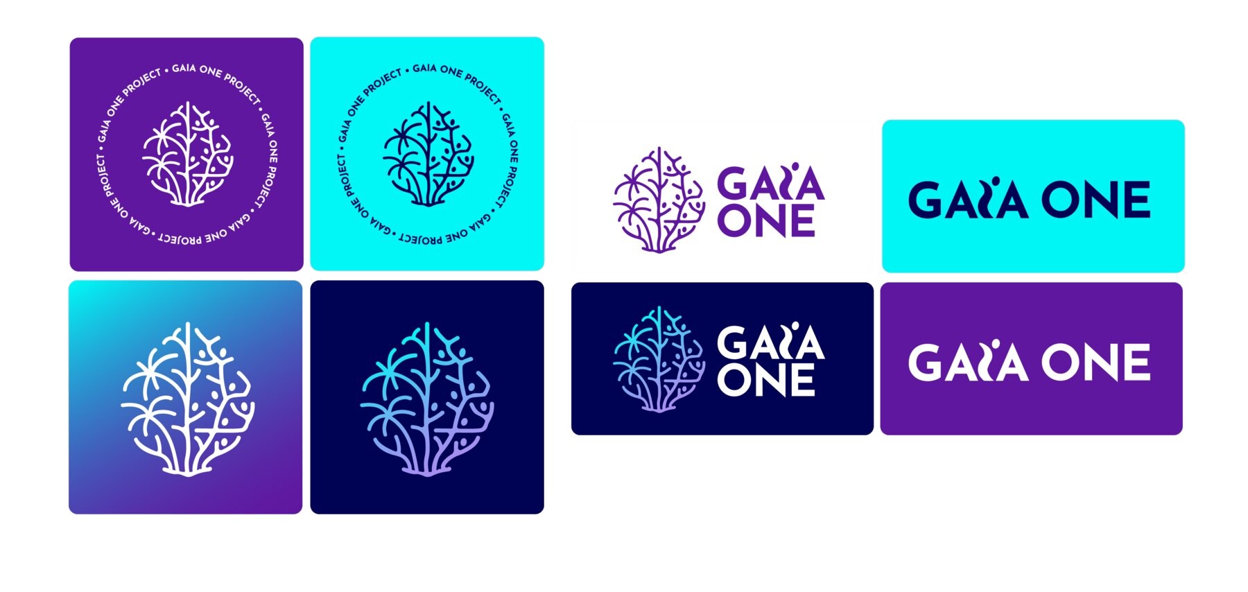
Ocean: the symbol starts from the ancient symbol for Mother Nature, reshaped to look like coral for the reef restoration work. Land: the other half is a coconut tree, for the trash clean-ups on shore. Logotype: the "i" in Gaia is a custom letter shaped like a person, so every individual can be part of the movement to restore and preserve Tanjung Bira.
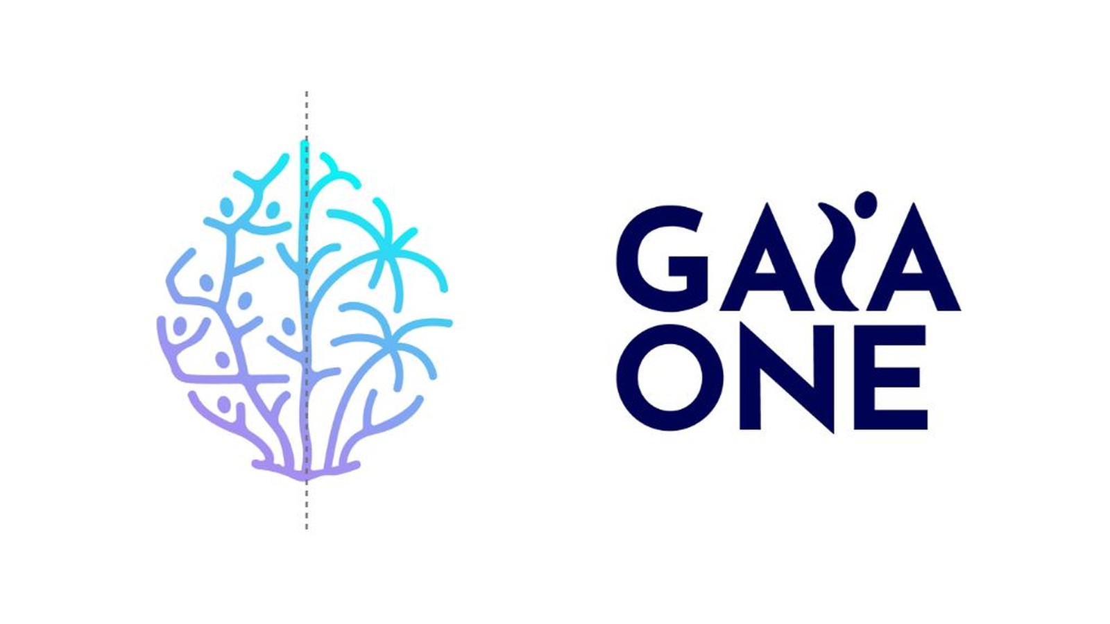
Gaia One mark split down the middle into coral and coconut tree, beside the logotype
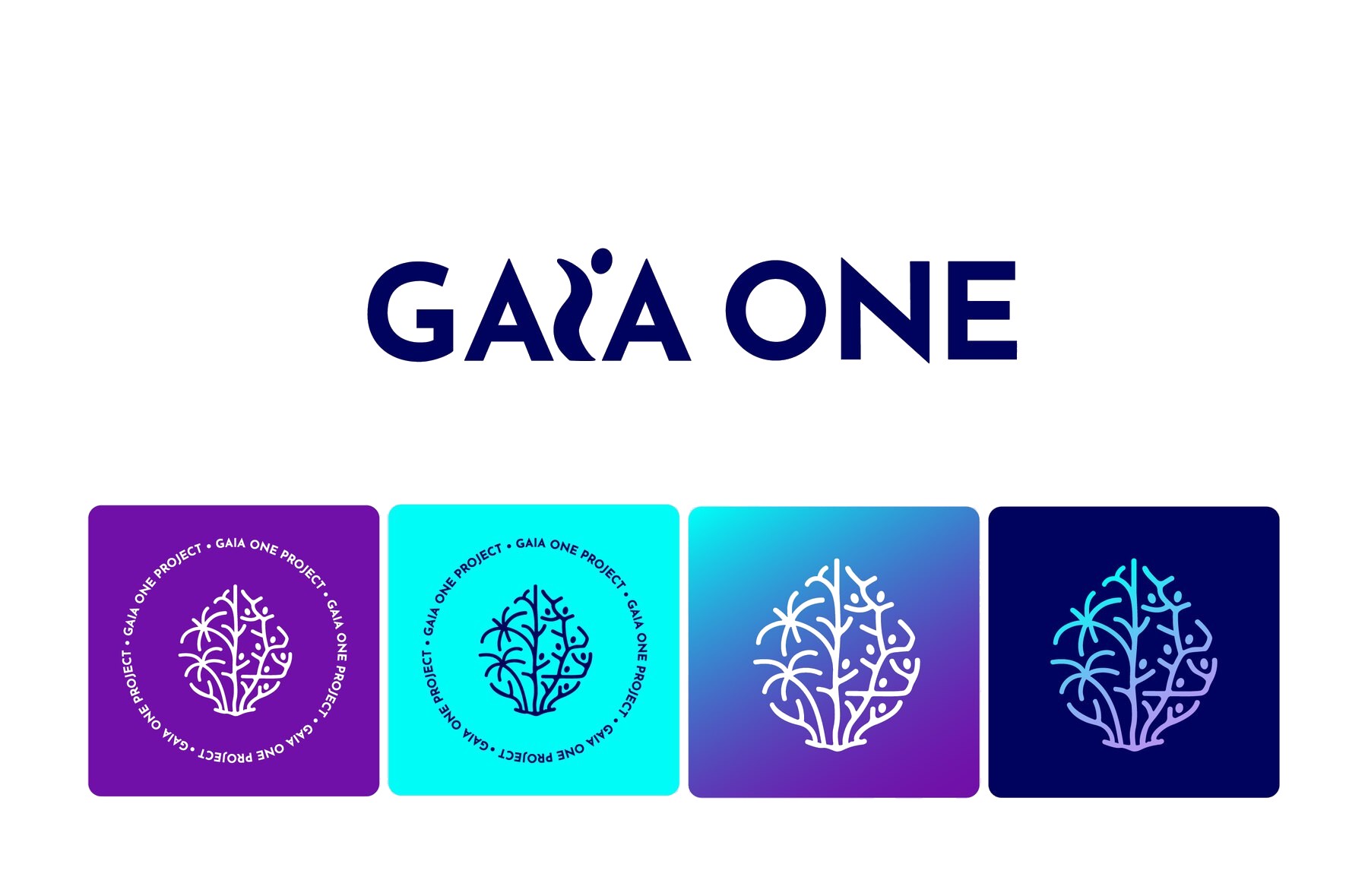
Gaia One wordmark above four symbol variations
Gaia symbol and coconut tree logo in badge, icon and lockup versions
02

Colour

Deep Purple, Deep Blue, Lilac and Turquoise, with a purple-to-turquoise gradient that shimmers like light through water.

03

Merchandise

T-shirts, water bottles, stickers and badges that turn visitors into ambassadors for the reef.

Gaia One identity across a T-shirt, water bottle, stickers and an Instagram feed
04

Social, led by numbers

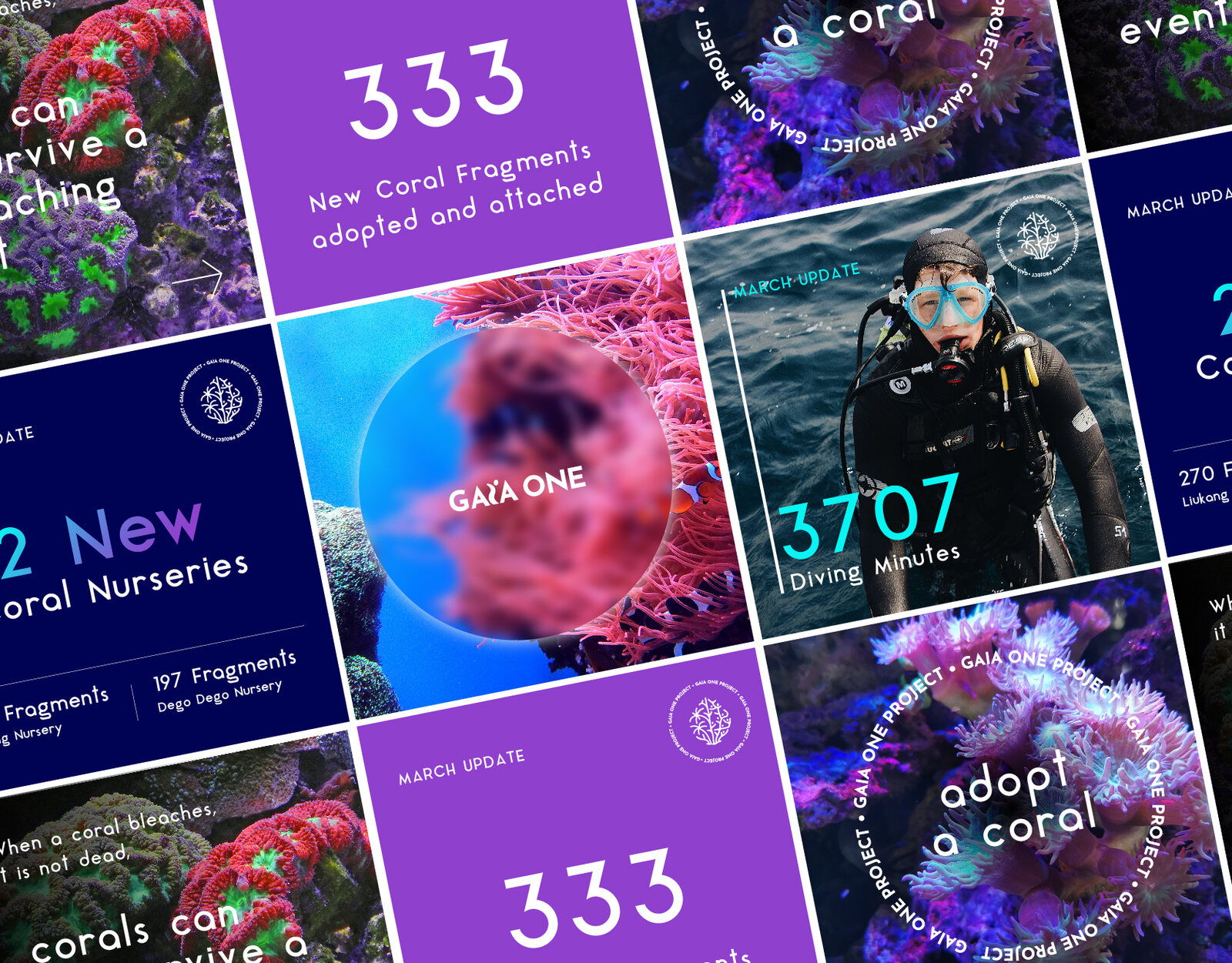
A feed built around live impact numbers: 333 coral fragments adopted and attached, and 3,707 diving minutes. The numbers do the persuading.

Grid of Gaia One Instagram posts with impact numbers and reef photography
The result

Up over the door, facing the reef

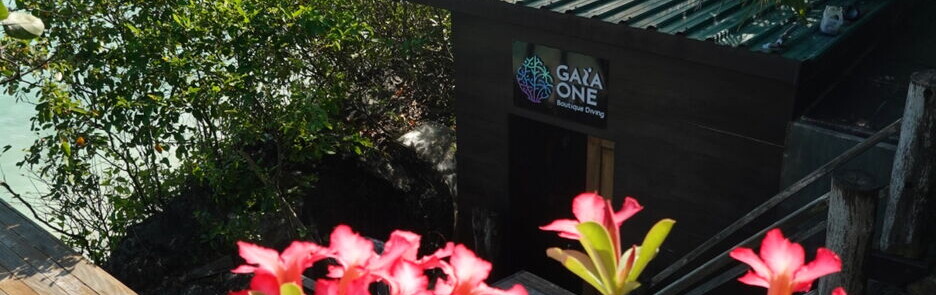
The identity is live across the dive shop, merchandise and social. On a visit to Tanjung Bira in 2025, I found the mark up over the door of Gaia One Boutique Diving, looking out over the reef it was drawn for.

The Gaia One Boutique Diving sign above the dive shop in Tanjung Bira, overlooking the sea
Contact

Hiring, or have a brand that needs direction?

PuhpoweeStudio