← All work
Case study · 01 / 07 · Mettle

How a recovery-first brandstood out in a categorybuilt on hype

Hydration drinks mostly sell speed, energy and transformation. Mettle, made with sparkling coconut water and no added sugar, needed a brand for people who move every week, not just on race day. I built it around one belief: consistency is the real performance.

Client

Mettle

Role

Brand strategy and design, solo

Services

Positioning, verbal identity, logo, typography, colour, packaging, social

Status

Launched in Kuala Lumpur

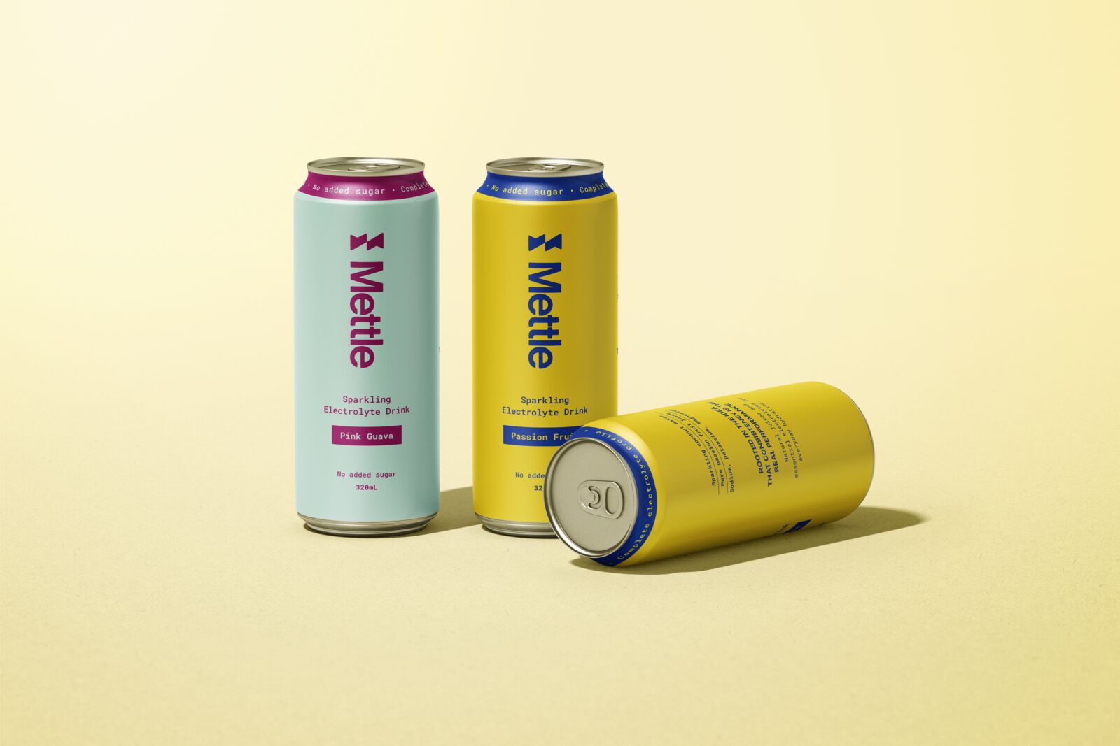
Mettle cans in Pink Guava and Passion Fruit on a pale yellow ground

The Challenge

  1. A category full of noise

    Hydration drinks are over-sugared, over-promised, and built around peak performance moments.

  2. Emotionally empty

    Performance-led brands chase energy, speed and transformation. None of them speak to effort and routine.

  3. A drink for every day

    Mettle is made to be drunk daily, so the brand had to feel credible on an ordinary Tuesday, not just on race day.

The Solution

  1. Own continuity, not intensity

    Character over performance, discipline over hype, consistency over intensity. The platform line: Built to return.

  2. Rules for what Mettle never is

    Never macho, never motivational-poster, never clinical, never aesthetic-first. Copy stays short and declarative: yes to "Strength, sustained." No to "Unleash" or "Next-level".

  3. Restraint as the visual idea

    A stripped-back system of black, white and cool accents, a monospaced typeface for order and routine, and ingredients listed plainly as quiet proof.

Outcomes

The system, piece by piece

01

The mark

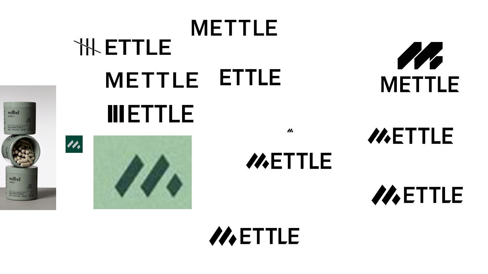
Two mirrored ticks: a familiar symbol of progress, made calm through symmetry and repetition. It reads as routine rather than a performance badge. The explorations tested a tally mark, a split M and a forward-leaning M before landing on the mirrored ticks.

Mettle horizontal logo in navy on mint
Mettle icon in white on Endurance navy
Sheet of Mettle wordmark and icon explorations
02

Colour

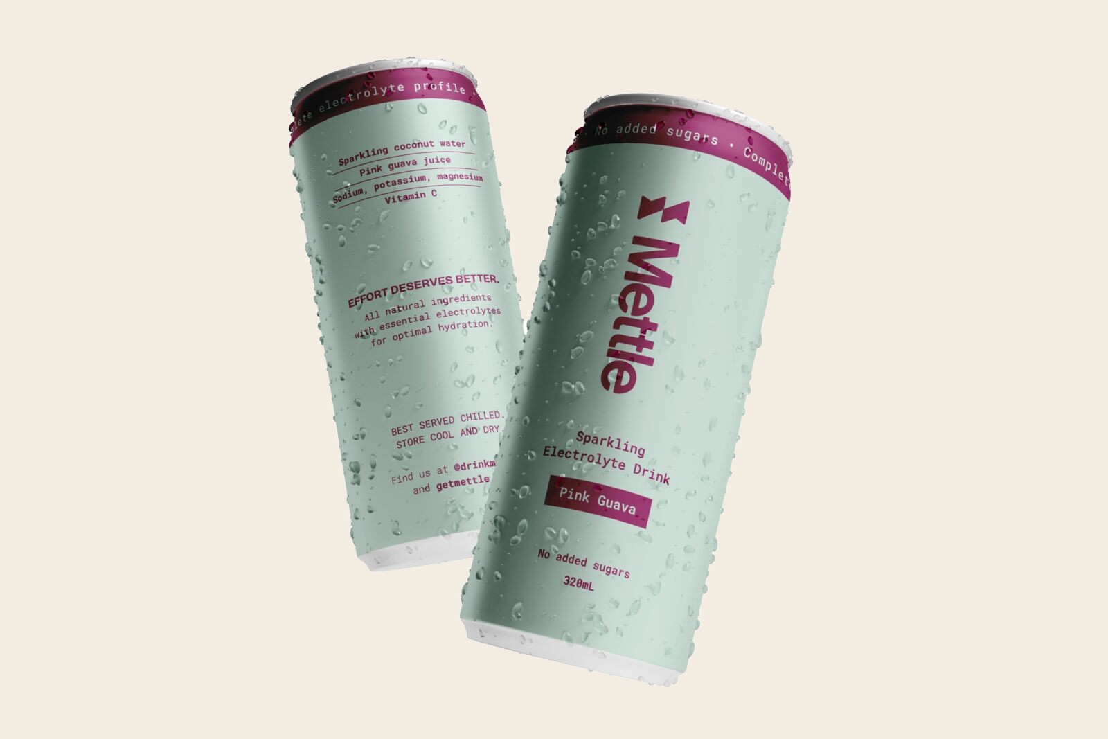
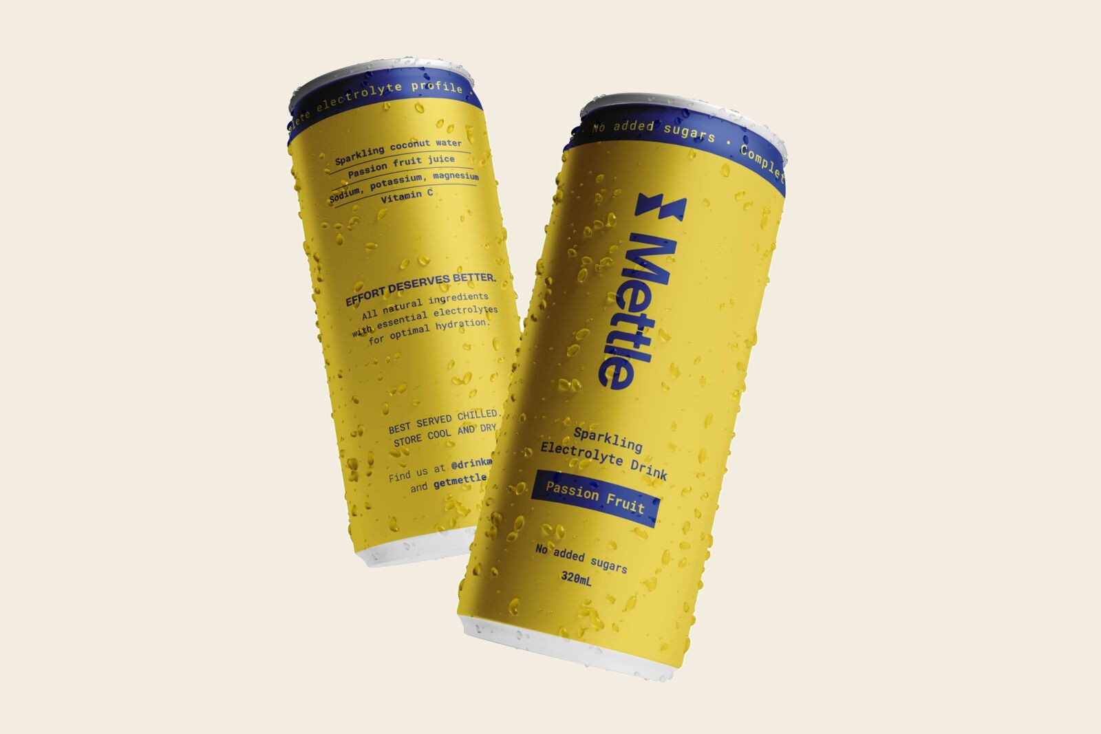
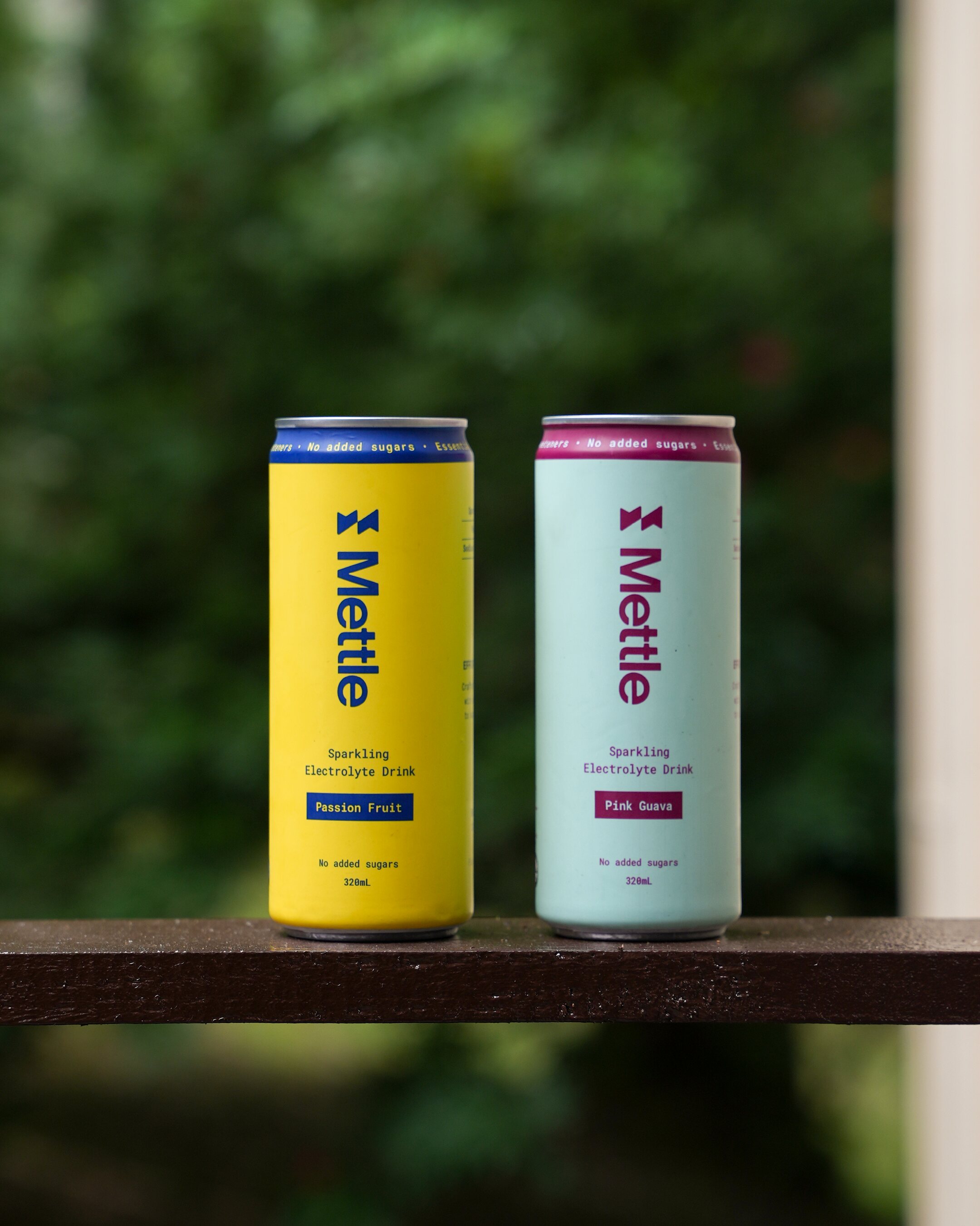
A stripped-back base of Endurance, Hydrate, Field and Iron keeps the brand clear and legible. Each flavour then gets one bold pair, so the range feels confident on shelf without shouting.

Two Pink Guava cans
Two Passion Fruit cans
03

Packaging

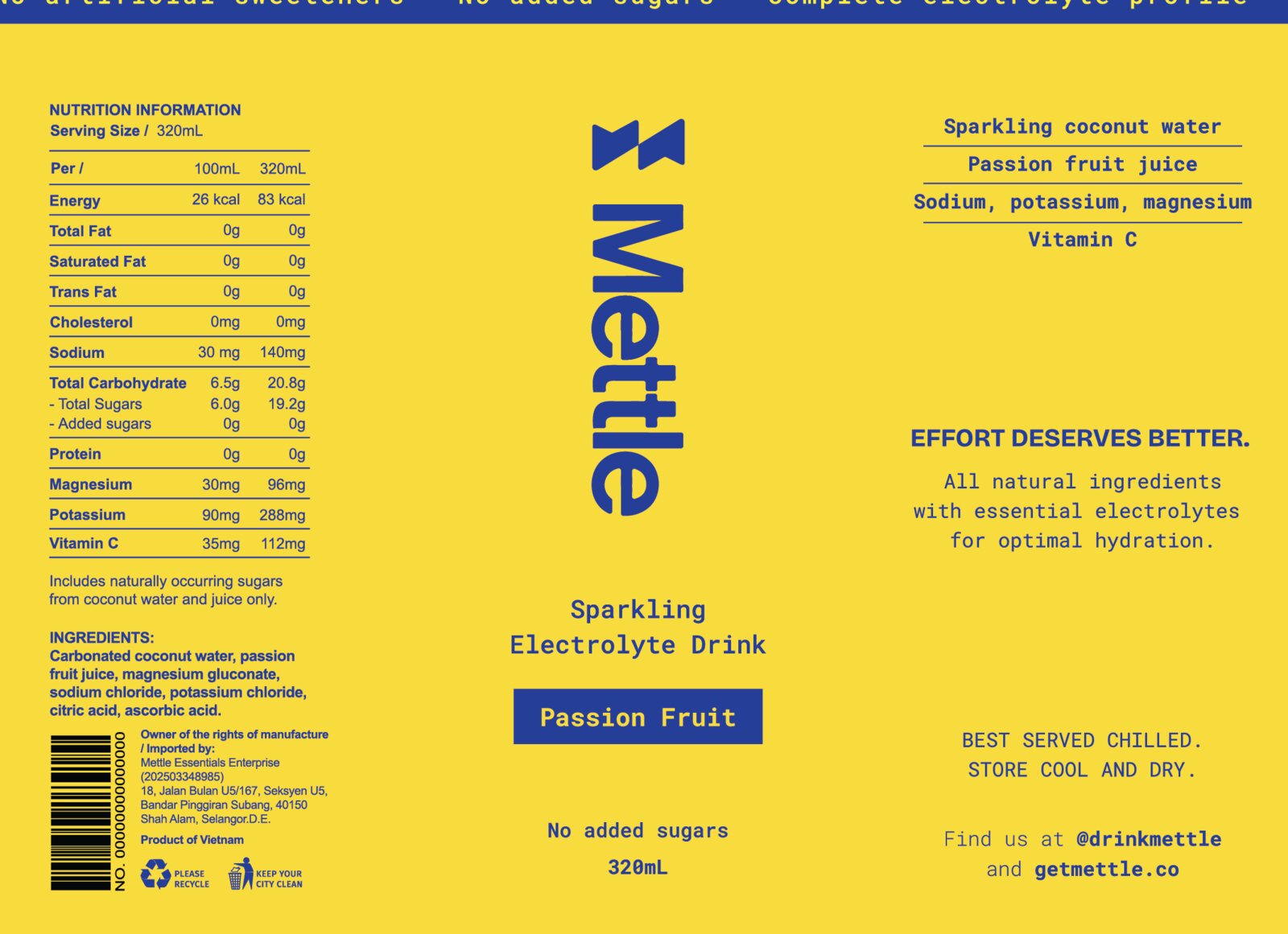
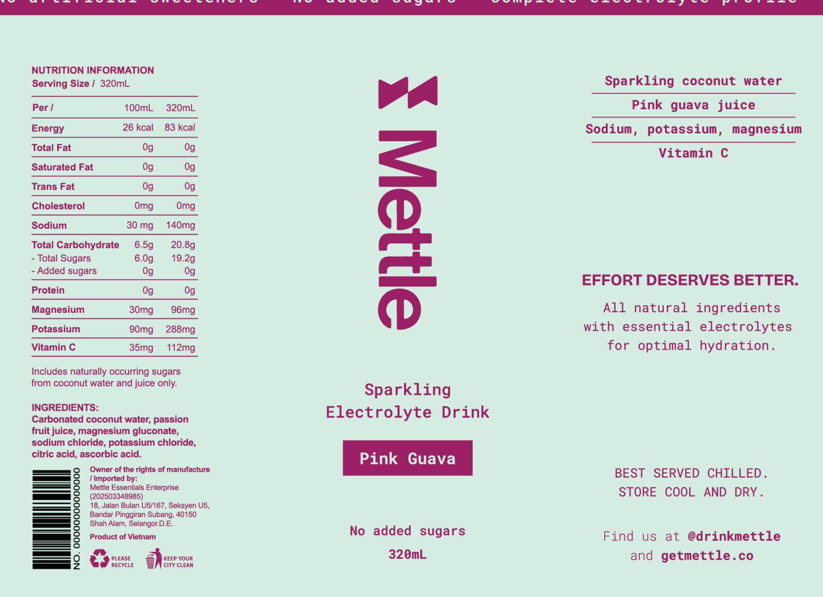
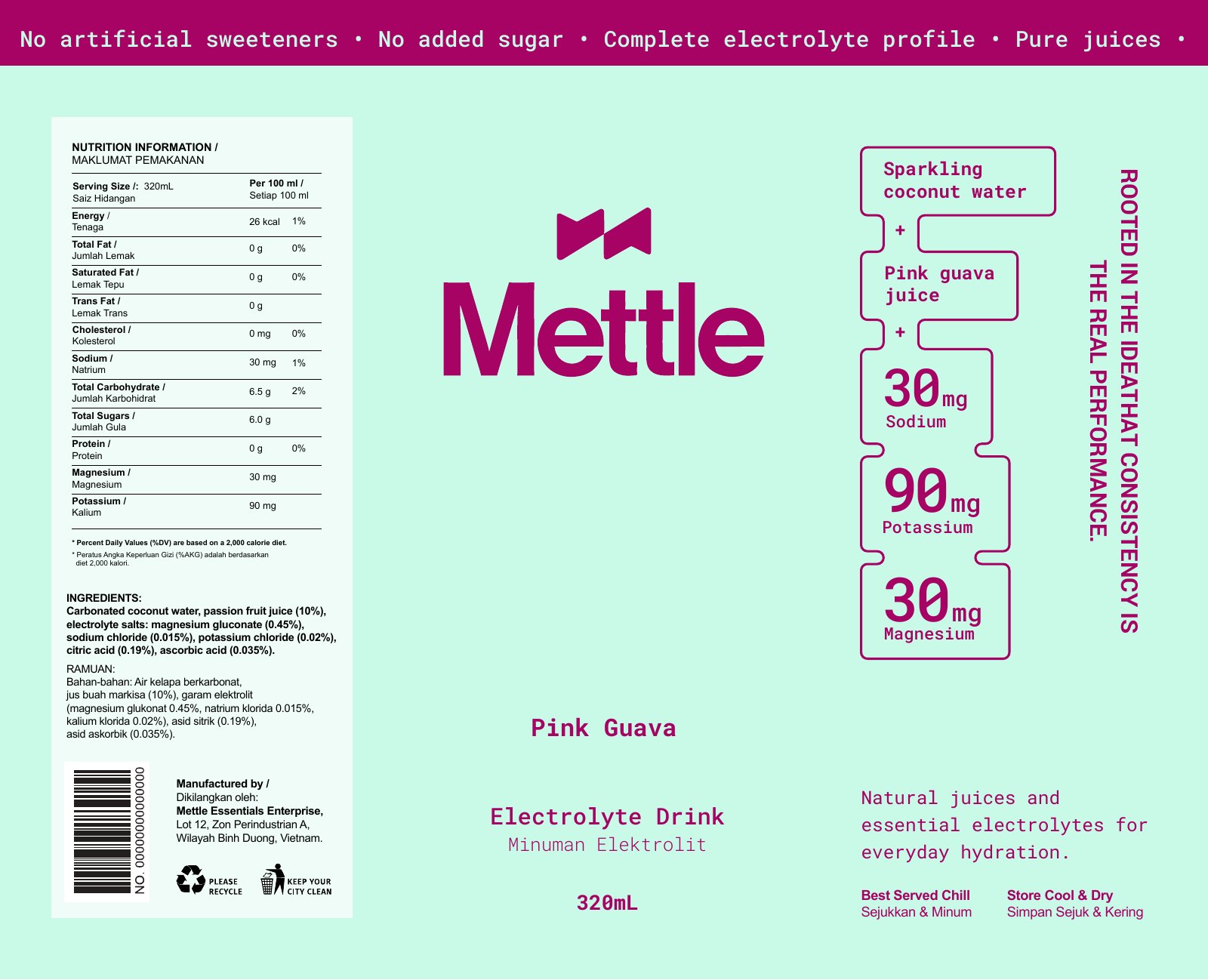
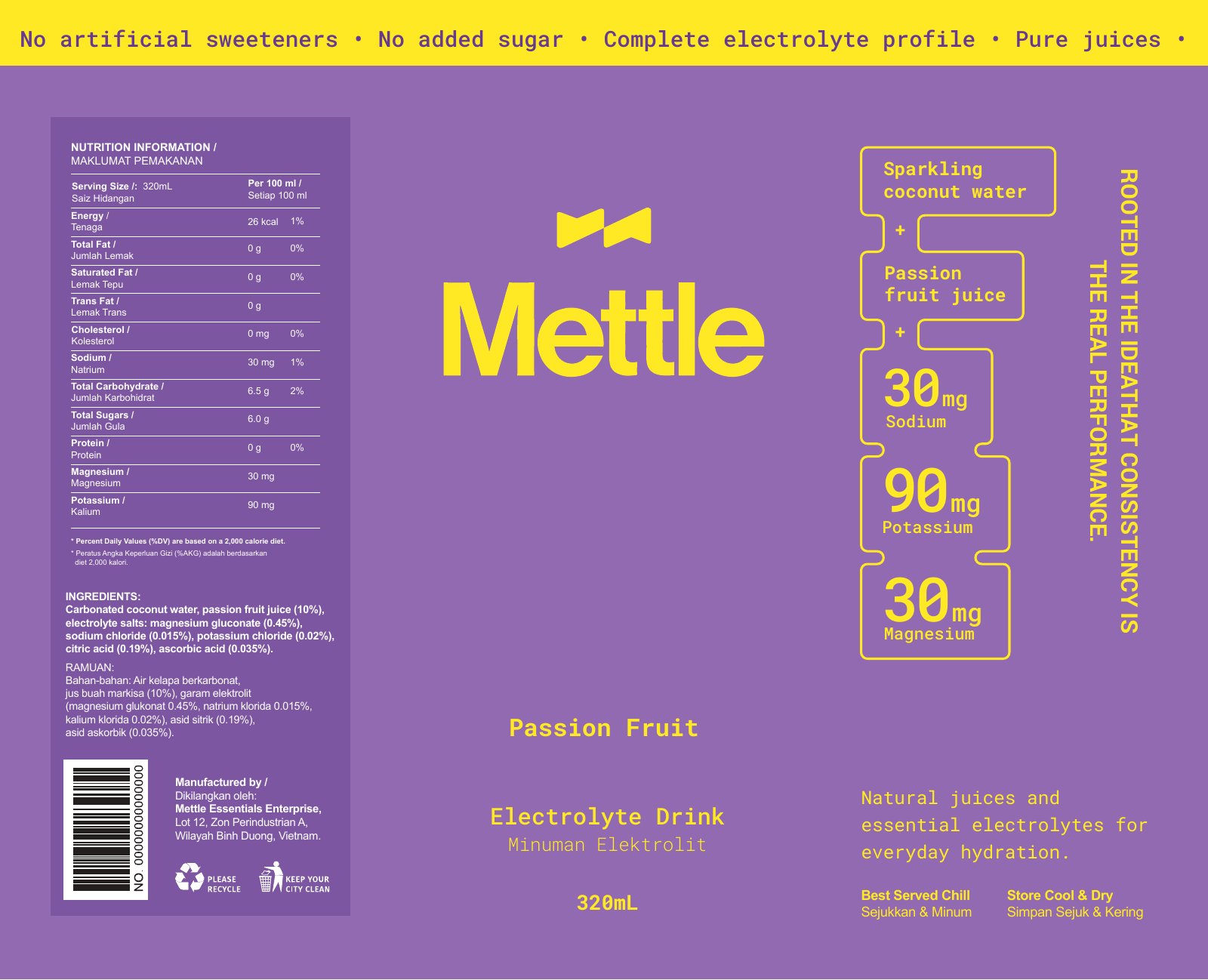
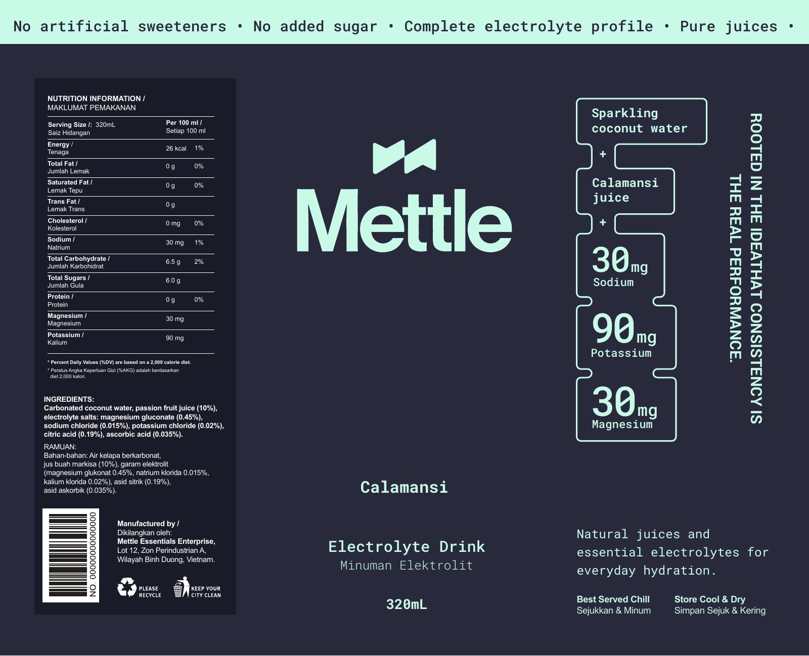
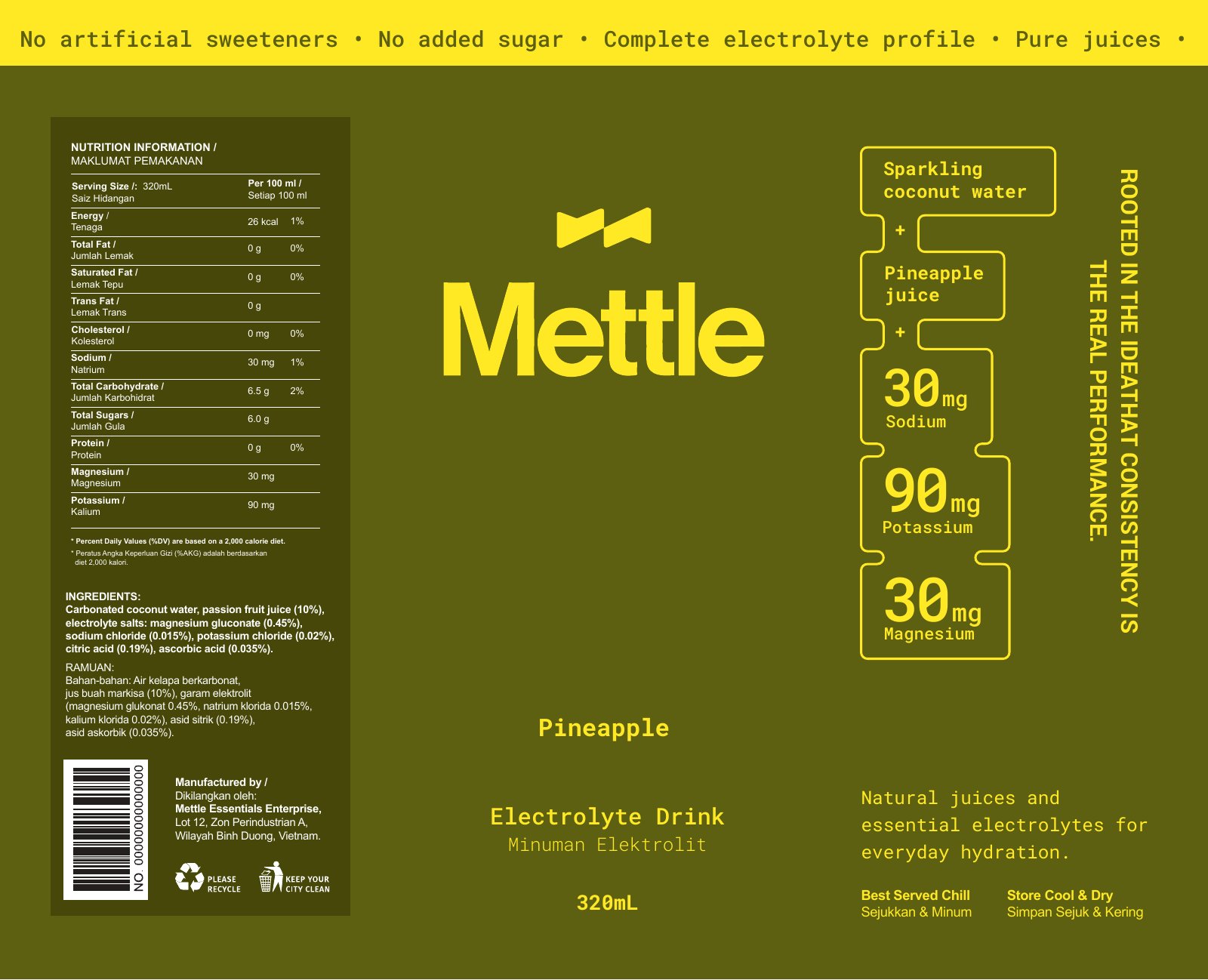
Every flavour follows the same layout and hierarchy. The wordmark runs vertically as the hero, the ingredients sit plainly as proof, and the only claim on the can is "Effort deserves better." The final Passion Fruit and Pink Guava labels sit on top. The row below shows earlier explorations of the same system across four flavours.

Final Passion Fruit can label artwork
Final Pink Guava can label artwork
Earlier explorations
Early Pink Guava label Early Passion Fruit label Early Calamansi label Early Pineapple label
04

In the world

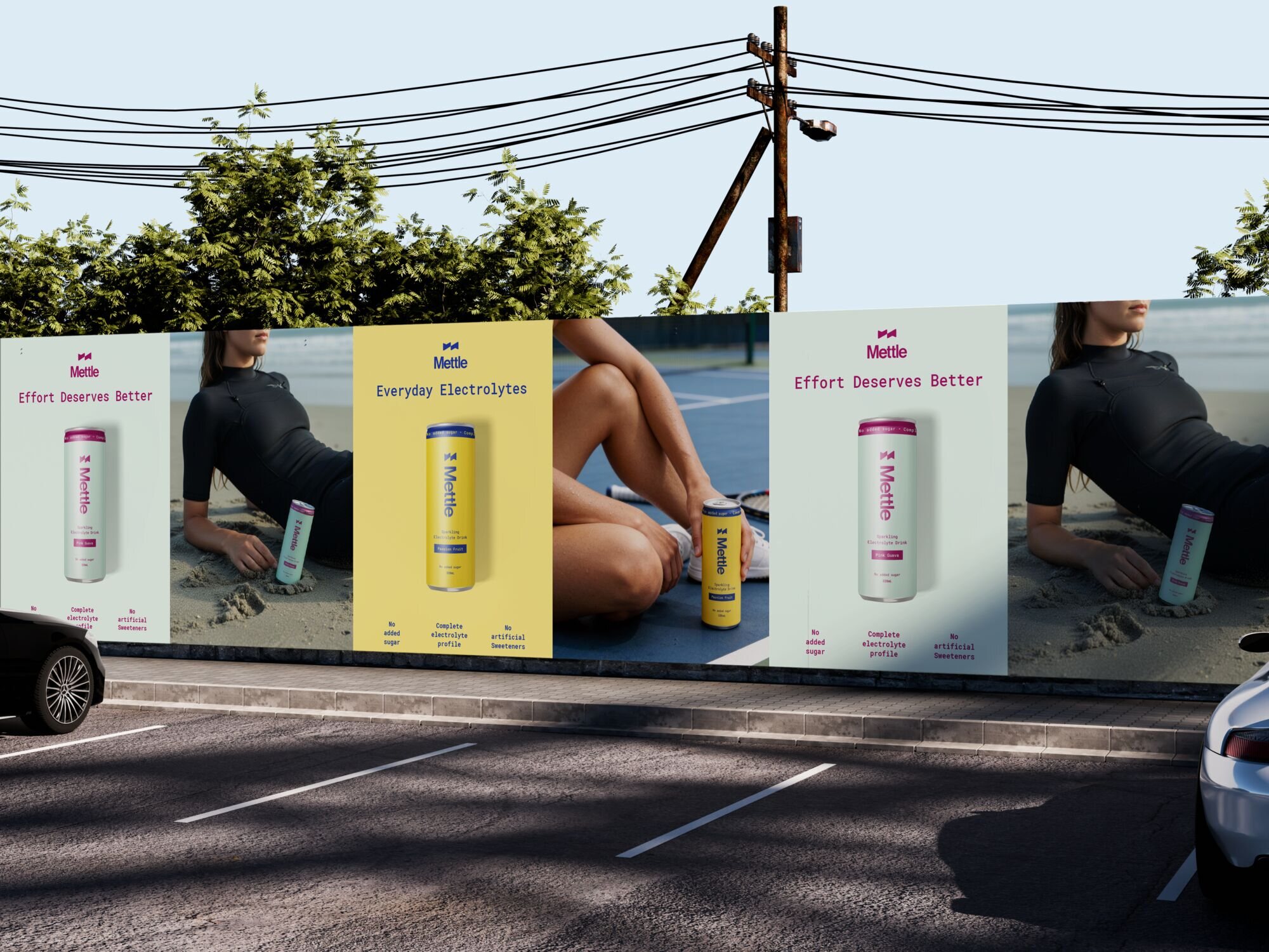
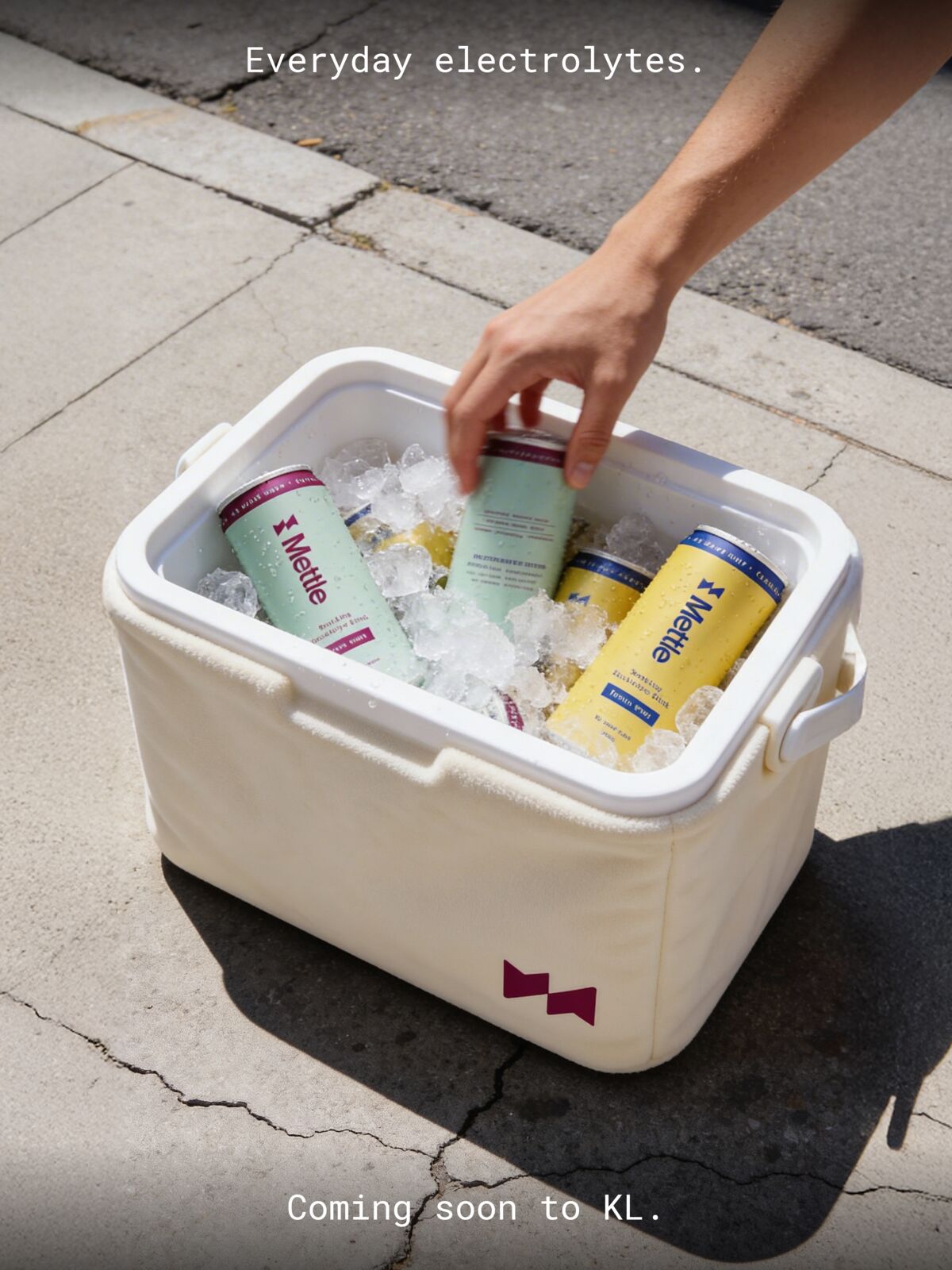
Imagery shows human moments between efforts, not action at its peak. No speed lines, no chaos. The launch lines stay short: "Everyday electrolytes." "Hydration, reimagined."

Mettle street billboards: Effort Deserves Better and Everyday Electrolytes
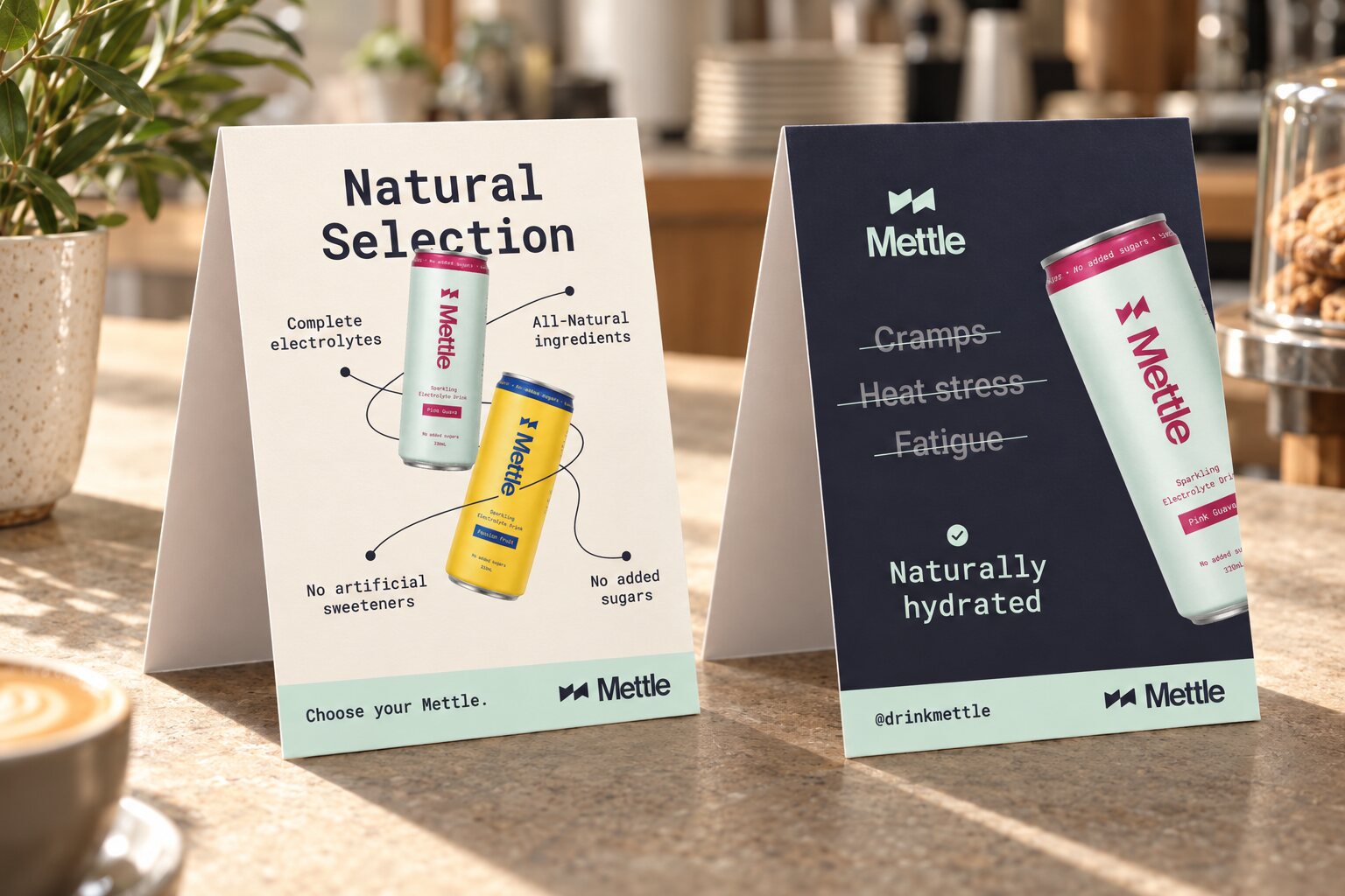
Mettle table tents on a cafe counter
A hand taking a Mettle can from a cooler on the pavement
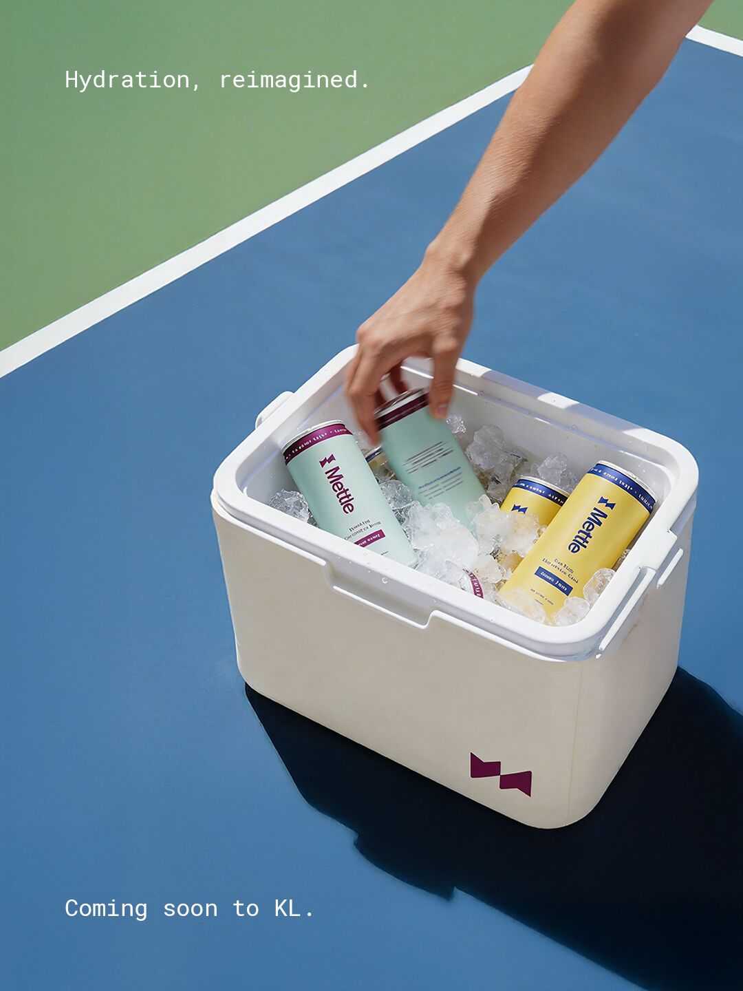
Mettle cooler on a blue court with the line Hydration, reimagined
The result

Credible where it appears

Mettle launched and is stocked at Jaga cafe and pickleball courts around Kuala Lumpur. That's the brand's own rule in practice: not everywhere, just in the places where people train, recover and come back.

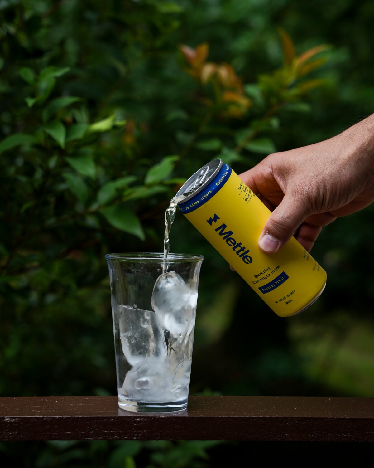
Mettle cans on a railing A Mettle cooler on a blue court A hand pouring Passion Fruit Mettle into a glass of ice on a railing
Contact

Hiring, or have a brand that needs direction?

PuhpoweeStudio