01
The logotype
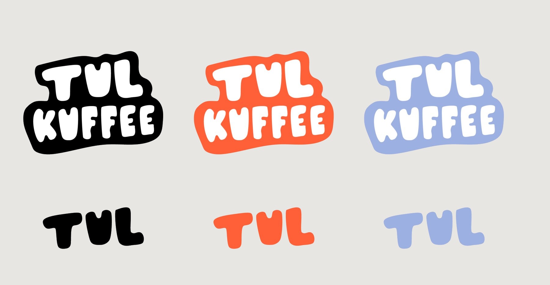
Hand-drawn lettering, chunky and rounded, set in a wobbly badge. A primary lockup and a short "TUL" mark, each in black, orange and lilac.
Tul, a Malaysian coffee brand, wanted to stand out from the clean, minimal look most coffee brands share. They asked for something vibrant, raw and fun, with room to grow into new products. I built the identity around a hand-drawn logotype and a cast of surreal, psychedelic illustrations.
Most coffee brands look clean, minimal and much the same. Tul needed to stand apart on the shelf and in the feed.
The client wanted energy and personality, not polish.
The identity had to stretch to new products later without a redesign.
On a shelf full of beige and white, the loudest thing you can do is look handmade. The brand's personality is relaxed and very local, so it should feel santai, not polished.
A custom, hand-drawn logotype: bold, chunky and rounded, and recognisable at any size.
The logotype stays constant while the illustration changes, so every new product can join the range and still feel like Tul.
Hand-drawn lettering, chunky and rounded, set in a wobbly badge. A primary lockup and a short "TUL" mark, each in black, orange and lilac.
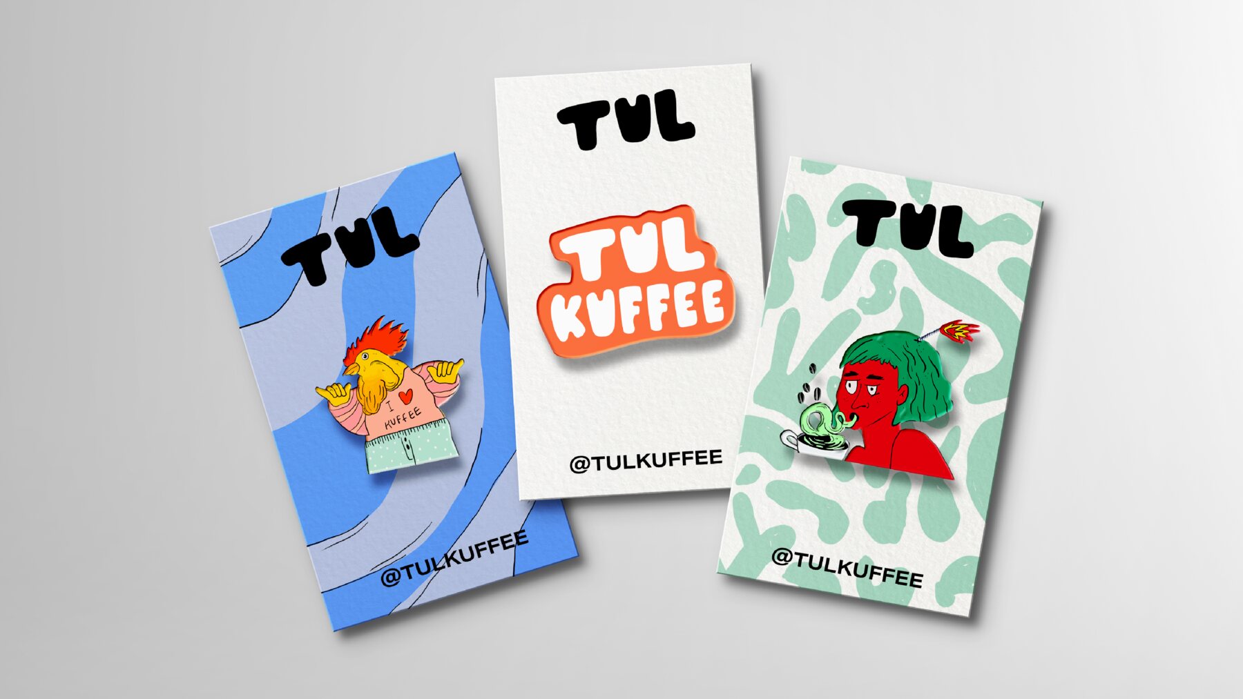
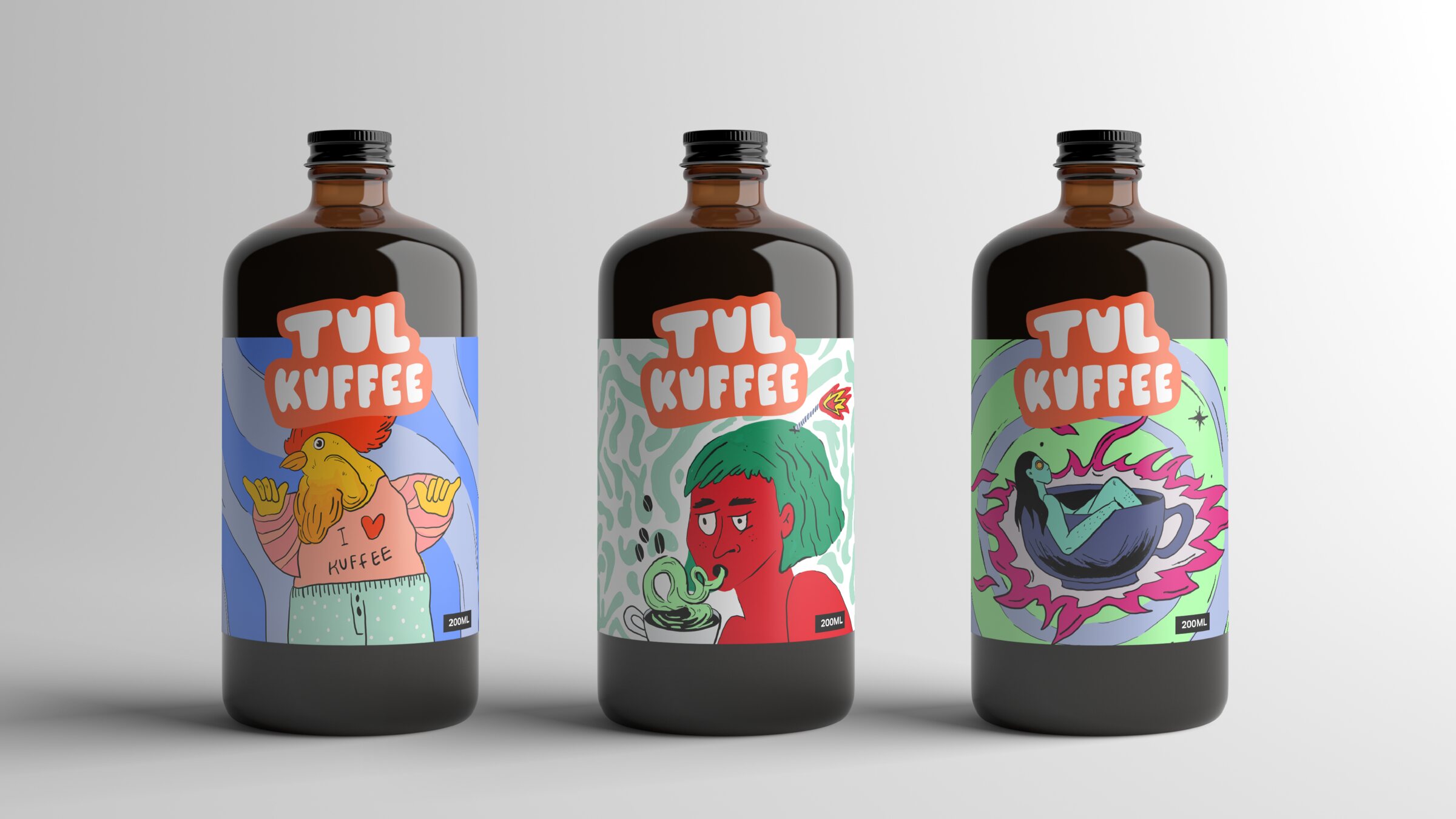
Illustrations that mix surrealism and psychedelic art, so each product and post has its own personality: Crack Chicken, Cuppa Crash and Super Slurp.
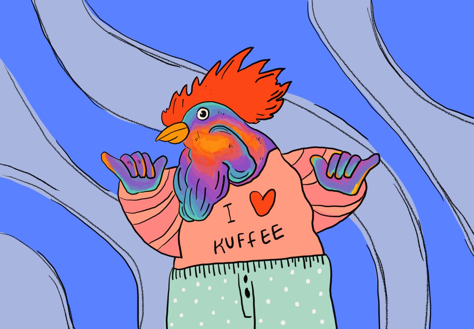
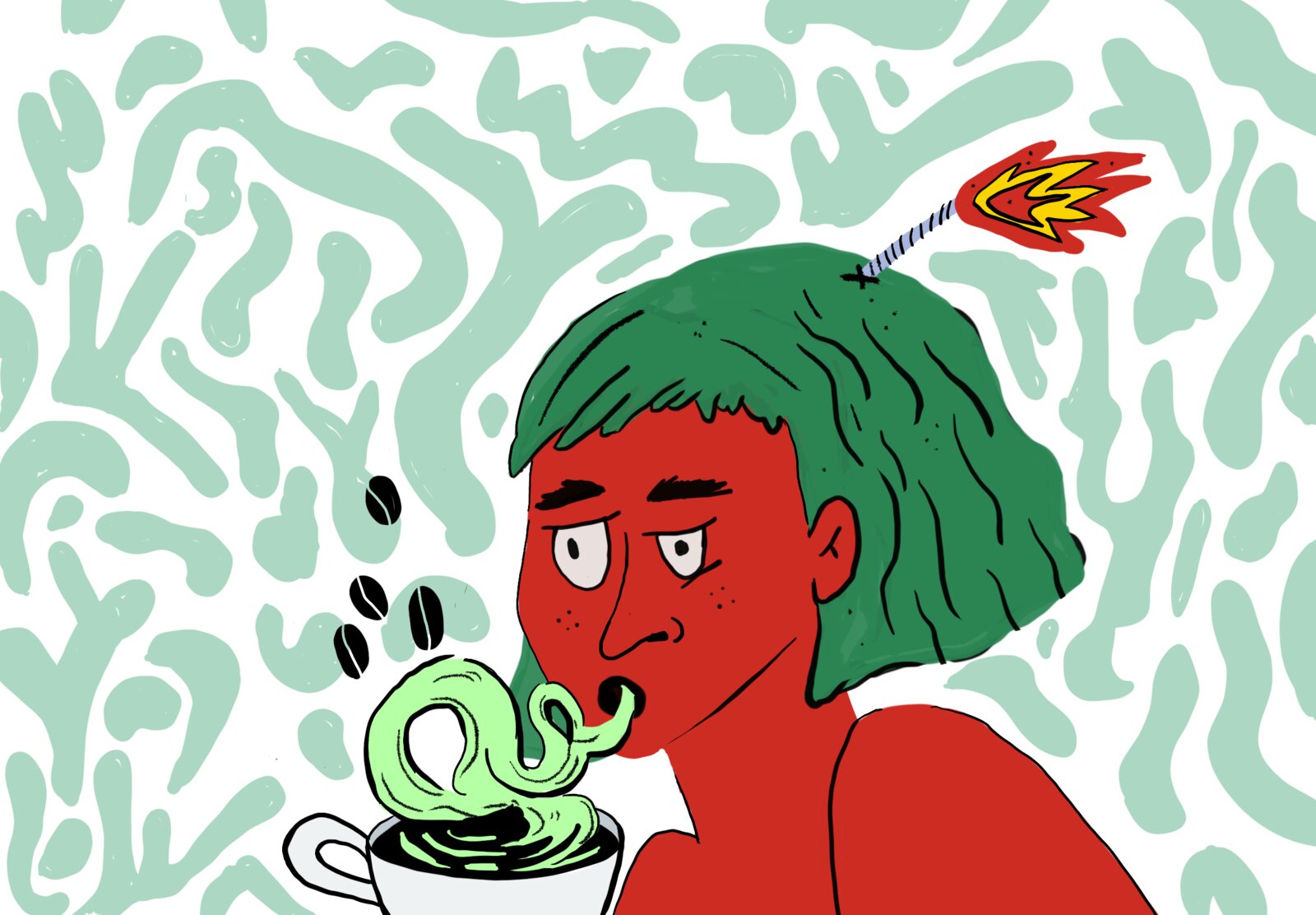
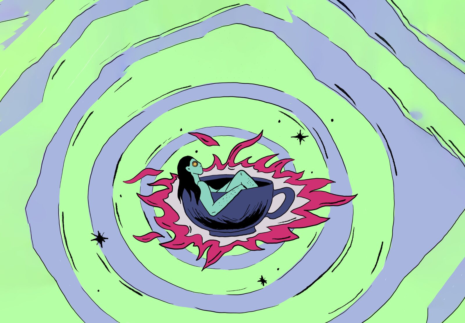
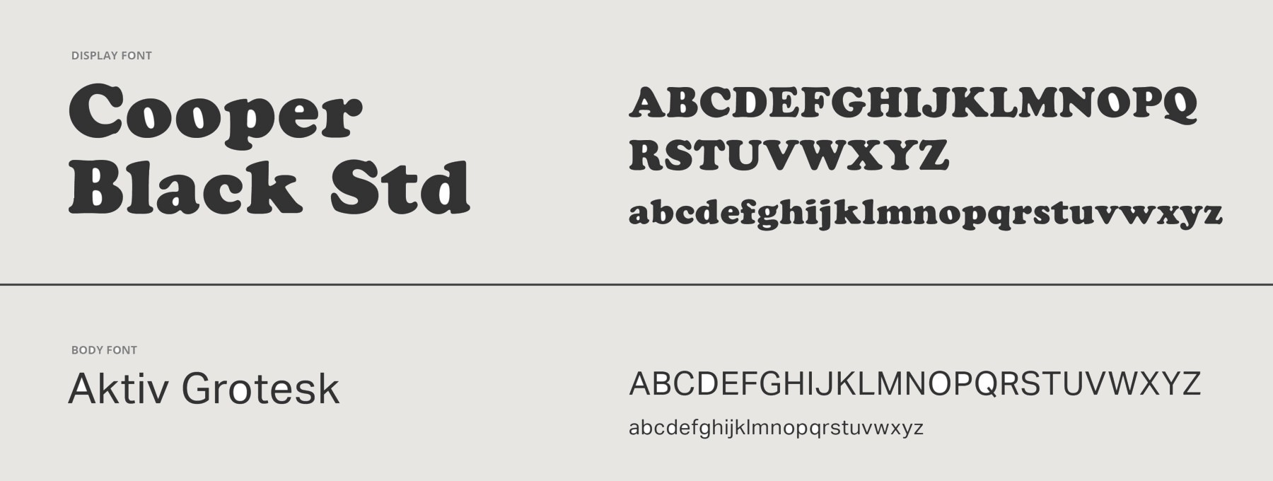
A loud palette of orange, lilac, mint green, peach and blue, with Cooper Black for display and Aktiv Grotesk for everything else.
Bottles and pouches where each product gets its own illustration inside a consistent frame, with the logotype always leading.
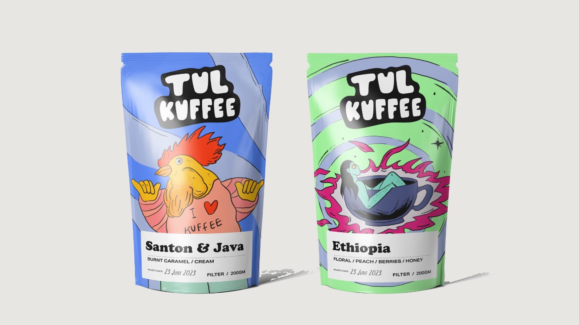
Tul Kuffee launched with the full identity, illustration set and packaging, and the brand is live today.